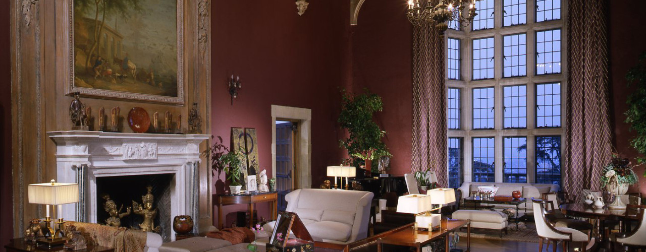
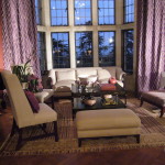
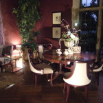
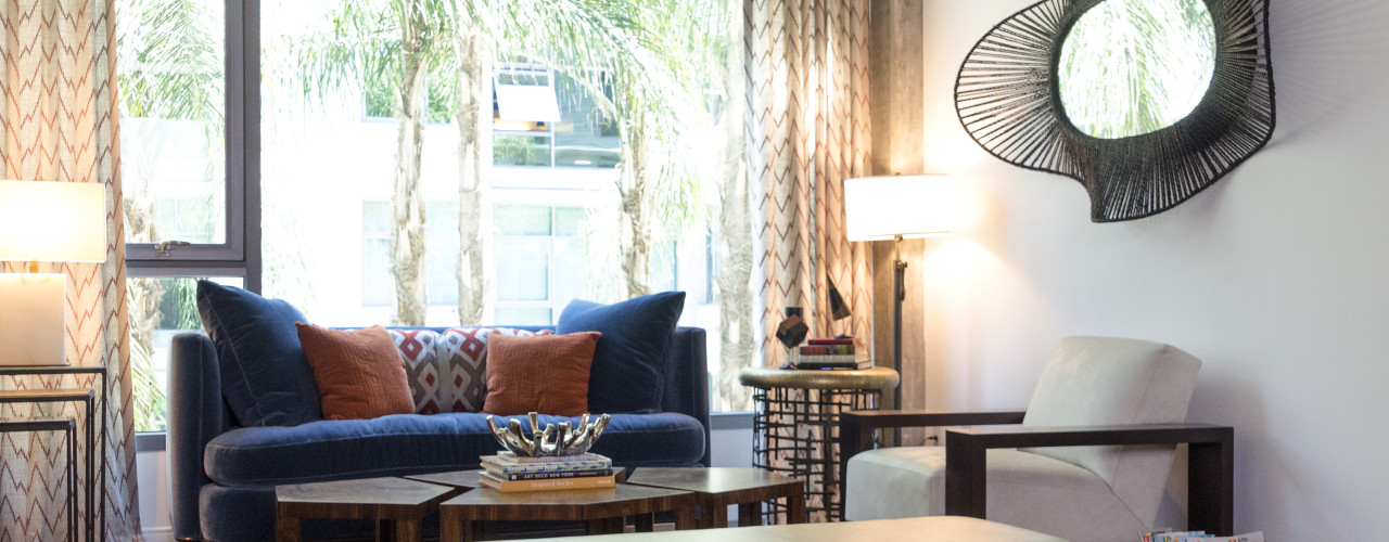
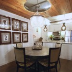
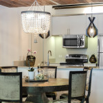
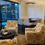
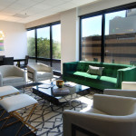
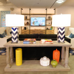
The architecture of this room, Living Room, has a striking blend of carved Elizabethan and classical motifs. The mixture of styles here speaks volumes about the Doheny family’s eclectic tastes. To accomplish the directive of creating a space that the family would enjoy, if they still lived here today, I looked for an approach that I thought would bridge these diverse influences of the past with an aesthetic of today. Hollywood Regency, a mid-century style that embraces classical forms with theatrical embellished details, ash seen a resurgence in interior design making it easy to visualize as a theme the present day Doheny’s would embrace. Traditional Hollywood Regency is restrained to black and white, yet the gold and orange cast of the room’s woodwork, spurred me to flavor up the design with less traditional colors. By blending eggplant, deep red, and persimmon orange, an analogous color scheme is achieved. It adds a complexity and vibrancy to the room.
Press
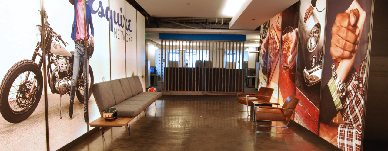
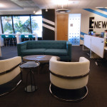
Through the enlightened guidance of the Esquire graphics team, the initial vision had been influenced “ala” Ace Hotel and other not quite steam punk or industrial Whimsy influences. However, the true genius of the look and feel of the brand came actually from the very need for the network to exist. It had been determined that a hole in high and masculine style existed within TV networks and cable. The unique approach to car out this niche was very instrumental in selecting the elements of the design.
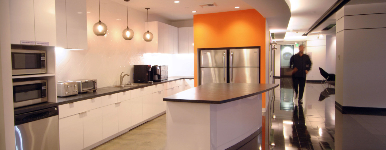
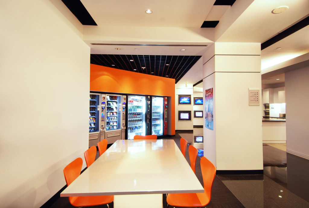
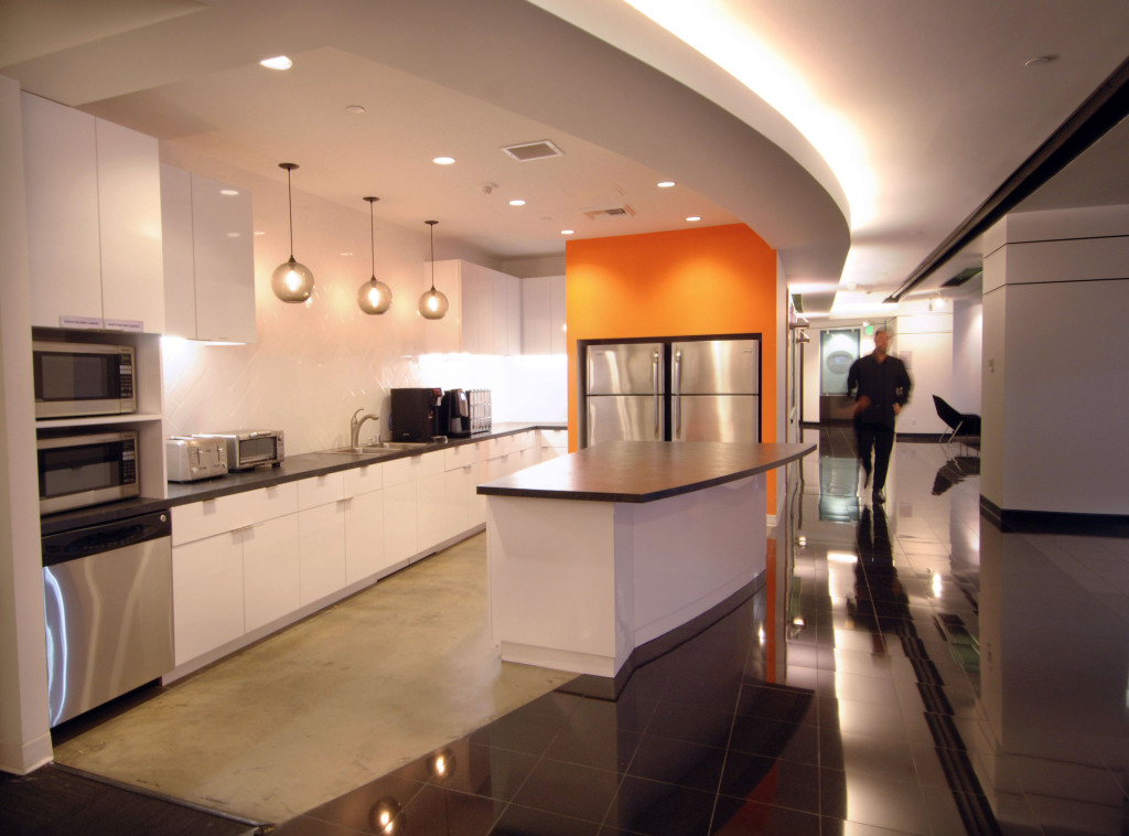
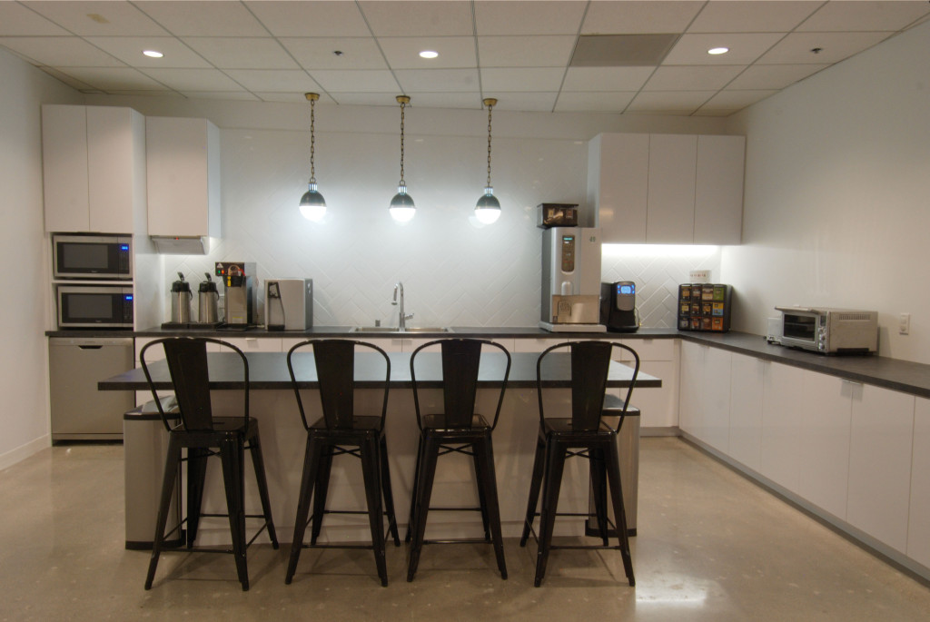
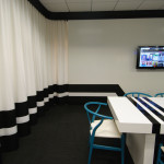
At the heart of the Company interior branding was the pantry. Born partly out of necessity to enlarge the current pantry, and the desire for an “opening up” of the space. The opportunity presented itself for the new networks interior branding opportunity.
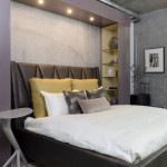
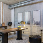
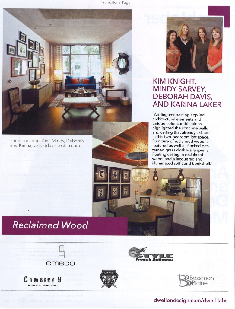
Adding contrasting applied architectural elements and unique color combinations highlighted the concrete walls and ceiling that already existed in this two-bedroom loft space. Furniture of reclaimed wood is featured as well as flocked patterned grass cloth wallpaper, a floating ceiling in reclaimed wood, and a lacquered and illuminated soffit and bookshelf.
- Custom bed surround with lighting and glass shelves
E!
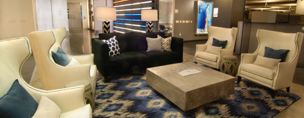
For E! Entertainment, one of the many reasons for the success of the collaborative work space was the joining of production and corporate activities. Even for those working in corporate departments, you knew that you were part of an entertainment company because the interiors did not silo departments in two separate suites. This came as a huge advantage when the corporate culture turned to embrace the open, collaborative trend.
The 450,00 square feet that Comcast Entertainment Group occupied had eight pantries that were becoming worn and dated after a decade of occupancy. Gensler partnered with our team to do initial research on what elements were being revealed as the “Pantry of the Future”. Deborah Davis Design, Inc. collected data from the client to research areas for improvement and Gensler offered past project experience with additional data on employee per square foot usage and past client lessons learned. The resulting document which reported best practices for the “Pantry of the Future” was the practical influence and space planning element of this project.
Over a few years, DDD inc. developed a design that embraced the new branding of the various Networks that comprised CEG and was scalable over the 8 pantries that were remodeled with 3 different general contractors. Project management as well as space planning, finish selection, and beverage appliance research was combined to create the pantry installations.
While conducting space planning analysis, it can be insightful to also review workflow analysis and group process as it is impacted by the space we design.
- E! Pop of Culture Rebrand
- Esquire Channel Rebrand
- International Rebrand
- E! News Rebrand
Collaborative Workspaces
- E! News Rebrand

