E!
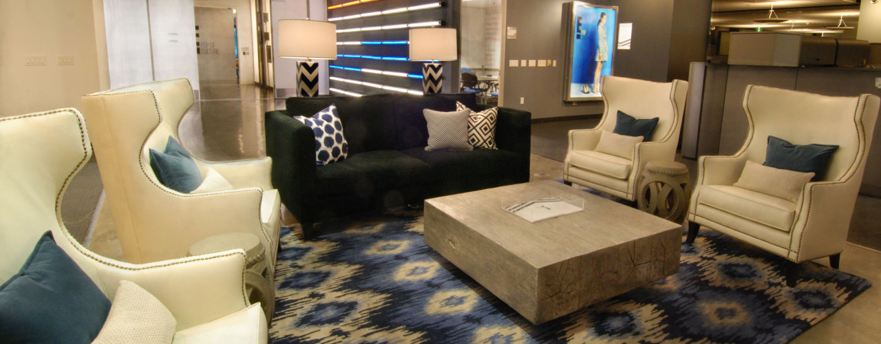
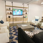
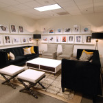
Entertainment’s headquarter offices had, for a long time, enjoyed a multicolored and whimsical brand from the 90’s. So when it came time to re think the environment to exude their newly created on-air marketing image “Black and white with a pop of culture” was a carefully planned, boldly executed, complete flavor change. Extensive work had gone into the development of the on-air brand, followed by deliberations on the best way to communicate a two dimensional print and online vision into a three dimensional work space. Collaborative effort with the in house graphic design team went into every elevation and design with specific intent behind each shade. In tandem with the re-brand and redesign of the E! headquarters spaces, was an effort to include the new trend of open, collaborative work spaces. Since the occupants were now bursting at the seams, the last decade had brought a “tightening” of corridor areas and conversion of coffee rooms into offices and edit bays. In addition to the growing demands on conference room space, many rooms had developed into multipurpose shoot spaces. The result was making it more and more difficult for teams to schedule spaces for their, at times last minute, creative planning needs. This unsatisfied requirement in concern with the desire to have granted areas of interest for functional reasons as well as to revisit the fun and playful yet productive way of working this company has always enjoyed.
For E! Entertainment, one of the many reasons for the success of the collaborative work space was the joining of production and corporate activities. Even for those working in corporate departments, you knew that you were part of an entertainment company because the interiors did not silo departments in two separate suites. This came as a huge advantage when the corporate culture turned to embrace the open, collaborative trend.

