
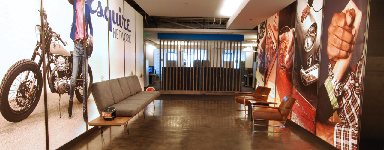
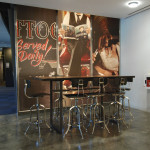
Through the enlightened guidance of the Esquire graphics team, the initial vision had been influenced “ala” Ace Hotel and other not quite steam punk or industrial Whimsy influences. However, the true genius of the look and feel of the brand came actually from the very need for the network to exist. It had been determined that a hole in high and masculine style existed within TV networks and cable. The unique approach to car out this niche was very instrumental in selecting the elements of the design.
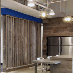

At the heart of the Company interior branding was the pantry. Born partly out of necessity to enlarge the current pantry, and the desire for an “opening up” of the space. The opportunity presented itself for the new networks interior branding opportunity.
corporate branding, design, pantry, visioning